LOVE LETTER TO THE UNKNOWN IN COLOUR
Interview to Raquel Espadinha (b.1997), lives and works in Lisbon, Portugal.
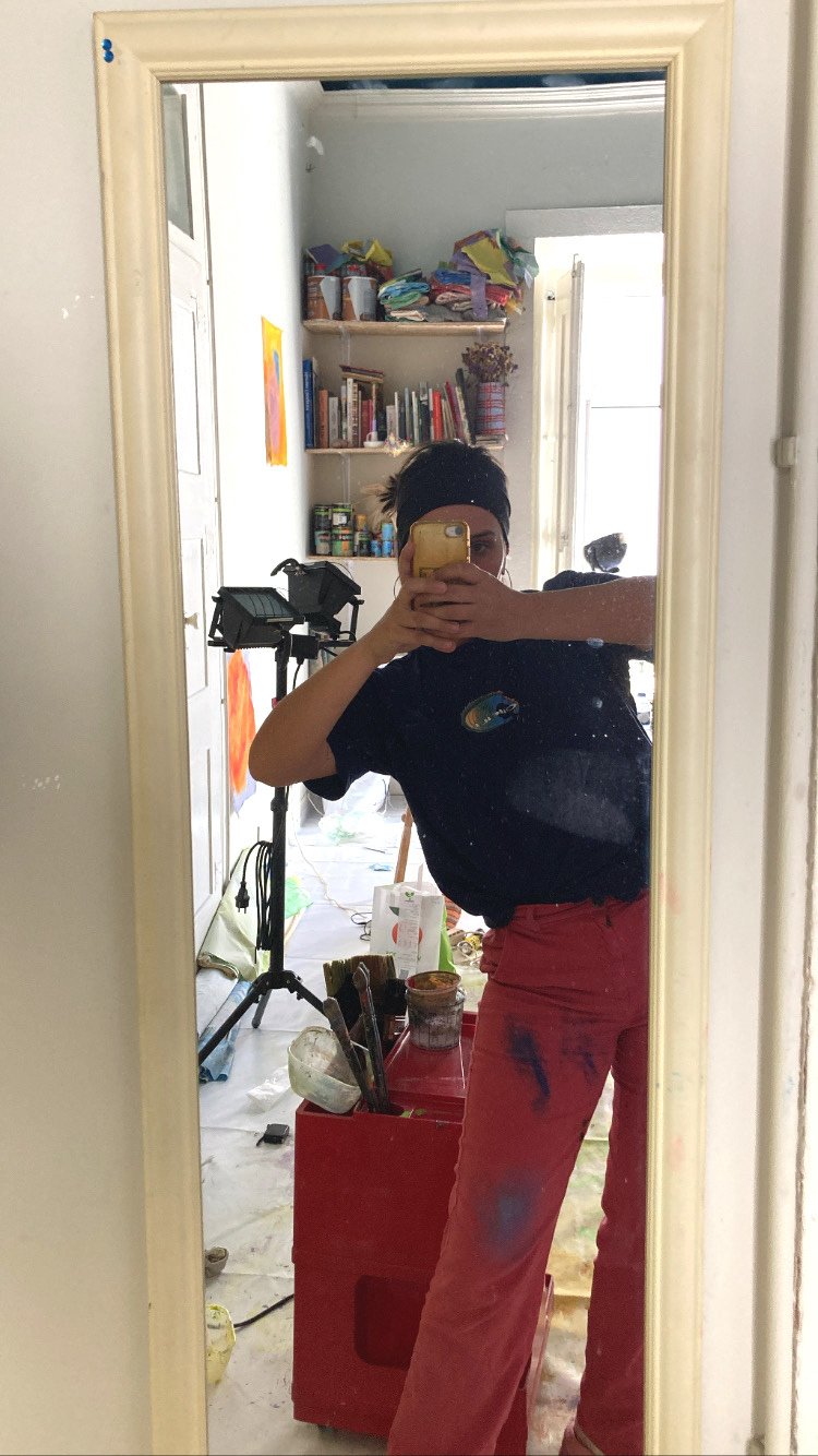
It's a shame that you don't have access to Raquel’s close friend group on instagram ahah, I do, and I frequently laugh out loud at her choice of filters and cringe vlogs of awkward encounters and drunken stories. Senhorita Raquel Espadinha is such a blast, she is the type of personality which projects naturally into her artistic practice. A funny but shy studio host who welcomes me everytime in the most lively and chatty mood. Art supplies, paints and books occupy the space in a hectic organisation: scraps of pure linen, some brushes soaking in a glass jar and stacks of old magazines.
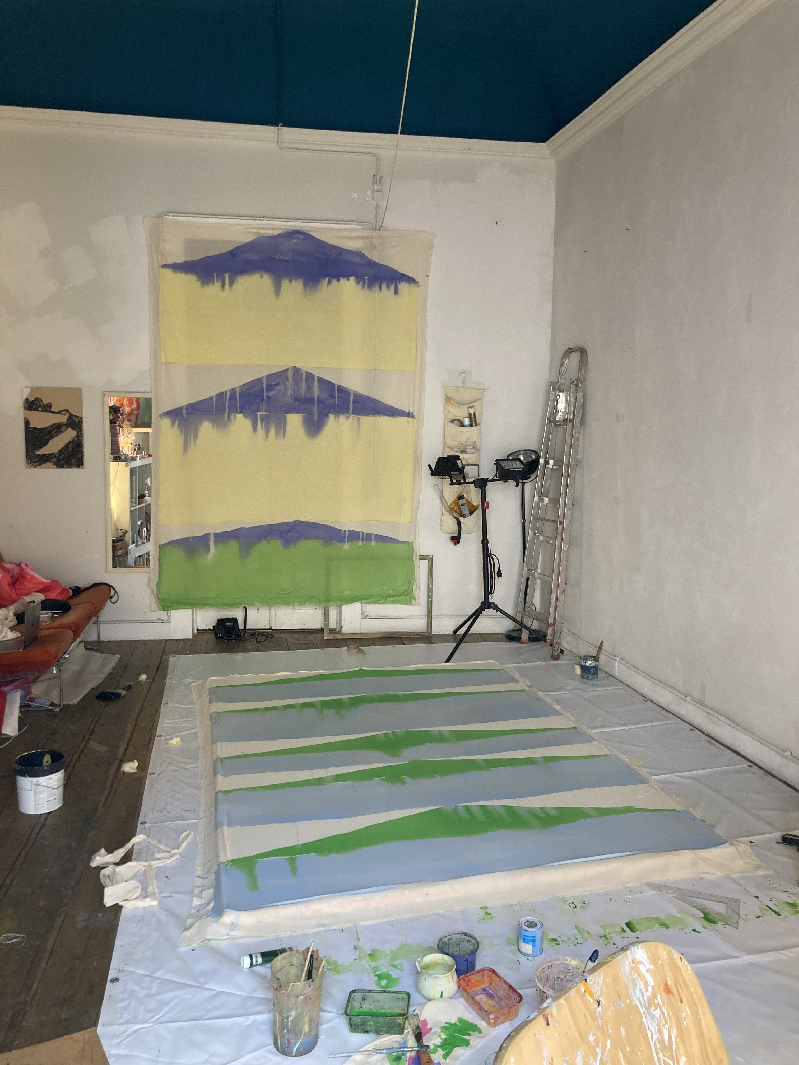
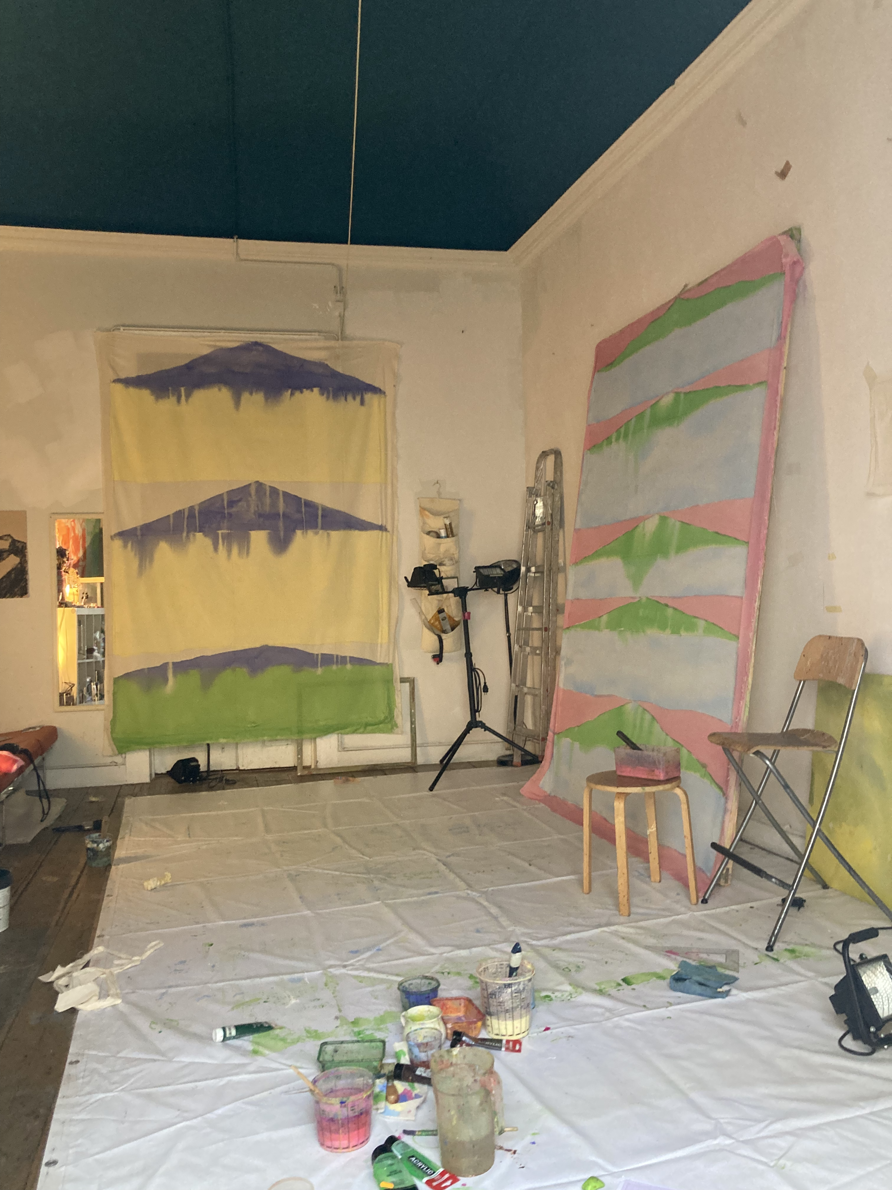
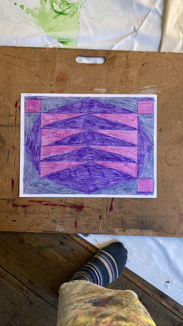
Upon entering her studio, I find one of the walls covered in paint, giving me clues on her most recent work. I see a lot of green, and behind the wall there is a literal mountain of very well kept rolls of fabric that she delicately unfolds, quickly filling up her studio as if it were a textile shop. She takes it as an opportunity to revisit some older works that have escaped her memory (and also as a way to justify all the trouble of putting them back in their place). It is impressive to observe the subtle changes from 3-months-old work, which has led her towards increasingly expressive shapes, moods and styles. I spot that green again, now absorbed in a rectangle shaped canvas, hanging softly.
More and more I see Raquel’s questioning of colour as one that can only be answered by experimenting. This work is part of a growing series of big scale rainbows produced in tinted canvas that play with regular conceptions of strict painting and textile design.
It's a shame that you don't have access to Raquel’s close friend group on instagram ahah, I do, and I frequently laugh out loud at her choice of filters and cringe vlogs of awkward encounters and drunken stories. Senhorita Raquel Espadinha is such a blast, she is the type of personality which projects naturally into her artistic practice. A funny but shy studio host who welcomes me everytime in the most lively and chatty mood. Art supplies, paints and books occupy the space in a hectic organisation: scraps of pure linen, some brushes soaking in a glass jar and stacks of old magazines.
Upon entering her studio, I find one of the walls covered in paint, giving me clues on her most recent work. I see a lot of green, and behind the wall there is a literal mountain of very well kept rolls of fabric that she delicately unfolds, quickly filling up her studio as if it were a textile shop. She takes it as an opportunity to revisit some older works that have escaped her memory (and also as a way to justify all the trouble of putting them back in their place). It is impressive to observe the subtle changes from 3-months-old work, which has led her towards increasingly expressive shapes, moods and styles. I spot that green again, now absorbed in a rectangle shaped canvas, hanging softly.
More and more I see Raquel’s questioning of colour as one that can only be answered by experimenting. This work is part of a growing series of big scale rainbows produced in tinted canvas that play with regular conceptions of strict painting and textile design.
Hey, Espadinha! In the past, you’ve crafted works patterned with letters, but you have recently changed towards a non-figurative style. Can you explain this evolution towards more abstract and colourful forms? Is it the result of research, or rather a spontaneous experiment?
Initially, the symbols which I called calligraphy never had a utilitarian purpose. The combination of the symbols did not represent ideas, they were in themselves an excuse for drawing and for creating visual rhythms. I don't see it as a shift to an abstract approach, as I believe I was already practising it before. The big difference from my past work to what I do now is that before it concerned drawing and now it's purely about painting.
![]()
Black is not a detectable colour in your pallet anymore. Do you feel like it limits natural forms? What is your relation to the colour, which is in itself the absence of it?
For a long time black was a constant in my work. This tone helped me think, as I find it to be impartial. It speaks and has the will to do it! There came a time when I felt that it spoke more than it should, so I reintroduced other shades. I can understand now that black helped me deal with colour. Using colour is not an intellectual choice. It exists almost like a living organism that vibrates and requests for other hues to be added. It lives in my work in a spontaneous and intuitive way. I really don’t understand chromatism and never will, but the unknown is what challenges me to look for the answer.
![]()
What moves you to embrace large scale formats? Do you envision them with a particular place to exhibit in mind?
I have always been attracted to large formats. Having to paint with the whole body is something that appeals to me, so much so that it becomes an adventure every time. I work with raw cloth, I enclose it in a wood grid, and after painting I dismantle it back to its original form. I like the way the material behaves, hanging loose from any structures. Raw cloth is a material that has life in itself, it reacts to external factors like wind, sunlight, scale… The surroundings are important factors in my work. Everything around us is related, and I want my work to be in that cycle of connectivity.
It all starts at the studio, as the space of production space influences the scale of the work. Sometimes it becomes limiting, because the tendency of what I do is always to grow. What attracts me is the experience itself, so the limitation of space becomes interesting because it pushes me to create new solutions to constantly expand. On the opposite end, the gallery is a disconnected reality, given by the fact that the relationship with the outside disappears, the element that gives context and scale to the white-walled rooms are the visitors themselves. My work does not subsist there to the fullest, it needs to be close to what gives it its’ real life.
![]()
You have often expressed an inclination to display your pieces suspended in mid-air. By liberating them from flat surfaces, do you mean to highlight their tangibility and visual impact?
When gravity acts on the cloth and it touches the ground or lands on some surface, from my experience the image tends to change. For this reason I’d rather have my pieces suspended for the sake of image reading. By doing this, I want to challenge classic conceptions of painting, as I believe that one should question the role of the grid as something that interferes with the artistic object. The grid limits a space in a three-dimensional way, it is still an object that has its own expression. It contains the canvas and stabilises it. Of course the rectangular shape where I usually work also delimits a space but I don’t believe it defines it in such a drastic way as the grid does.
![]()
Why do the figures that populate your paintings always appear so small in scale, isolated in a large space? Are you aiming for a specific effect with this?
Well, this has to do with two things. On one hand, it's related to the characteristics of the surfaces I use, which give me a grainy effect that I utilize to enhance the texture of the skin. The figures can't exceed the size of the grain in proportion, or else I lose that effect.
The other reason, which I realized relatively recently, is connected to the relationship in size between the viewer and the figure. If I paint them life-sized, it seems like these figures, which always contain something unsettling, are lunging at the viewer. Quite a violent impression. However, if I slightly reduce their size, the interaction becomes more intimate and endearing, neutralizing the effect to some extent. I think it's about finding that middle ground where neither the figure engulfs the viewer nor the viewer engulfs the figure. It's to ensure that the relationship between them remains balanced and the channel formed between the two stays open.
![]()
You have mentioned you prefer defining your creations as textile drawings instead of paintings. What attracted you to these terms?
I believe that drawing and painting belong to the same family, and that without drawing there is no painting, but they are still distinct practices: drawing lives from subtraction and painting from addition, and sometimes the line that differentiates each of them is hard to define. In the beginning of my practice, I was working on an alphabet that was based on shadows of incisions in ancient Egyptian tombs. These inscriptions created new characters that were used for writing. When we write we are also drawing, and that’s what I was doing. At that time, I was reflecting on drawing and the figures I did indeed draw. When I mentioned that, I was working on drawings that were done on large cloths with paint and brush. It is what you would call the traditional material and support of painting, but actually I felt I was drawing. In my opinion the support doesn’t dictate what I’m doing, but rather the content. Right now I am more dedicated to painting, although I have never stopped drawing. Painting about painting is the subject, the way the patches of colour dilute and interact ends up being a pictorial issue.
Words by Francisca Portugal
Initially, the symbols which I called calligraphy never had a utilitarian purpose. The combination of the symbols did not represent ideas, they were in themselves an excuse for drawing and for creating visual rhythms. I don't see it as a shift to an abstract approach, as I believe I was already practising it before. The big difference from my past work to what I do now is that before it concerned drawing and now it's purely about painting.
Black is not a detectable colour in your pallet anymore. Do you feel like it limits natural forms? What is your relation to the colour, which is in itself the absence of it?
For a long time black was a constant in my work. This tone helped me think, as I find it to be impartial. It speaks and has the will to do it! There came a time when I felt that it spoke more than it should, so I reintroduced other shades. I can understand now that black helped me deal with colour. Using colour is not an intellectual choice. It exists almost like a living organism that vibrates and requests for other hues to be added. It lives in my work in a spontaneous and intuitive way. I really don’t understand chromatism and never will, but the unknown is what challenges me to look for the answer.
What moves you to embrace large scale formats? Do you envision them with a particular place to exhibit in mind?
I have always been attracted to large formats. Having to paint with the whole body is something that appeals to me, so much so that it becomes an adventure every time. I work with raw cloth, I enclose it in a wood grid, and after painting I dismantle it back to its original form. I like the way the material behaves, hanging loose from any structures. Raw cloth is a material that has life in itself, it reacts to external factors like wind, sunlight, scale… The surroundings are important factors in my work. Everything around us is related, and I want my work to be in that cycle of connectivity.
It all starts at the studio, as the space of production space influences the scale of the work. Sometimes it becomes limiting, because the tendency of what I do is always to grow. What attracts me is the experience itself, so the limitation of space becomes interesting because it pushes me to create new solutions to constantly expand. On the opposite end, the gallery is a disconnected reality, given by the fact that the relationship with the outside disappears, the element that gives context and scale to the white-walled rooms are the visitors themselves. My work does not subsist there to the fullest, it needs to be close to what gives it its’ real life.
You have often expressed an inclination to display your pieces suspended in mid-air. By liberating them from flat surfaces, do you mean to highlight their tangibility and visual impact?
When gravity acts on the cloth and it touches the ground or lands on some surface, from my experience the image tends to change. For this reason I’d rather have my pieces suspended for the sake of image reading. By doing this, I want to challenge classic conceptions of painting, as I believe that one should question the role of the grid as something that interferes with the artistic object. The grid limits a space in a three-dimensional way, it is still an object that has its own expression. It contains the canvas and stabilises it. Of course the rectangular shape where I usually work also delimits a space but I don’t believe it defines it in such a drastic way as the grid does.

Why do the figures that populate your paintings always appear so small in scale, isolated in a large space? Are you aiming for a specific effect with this?
Well, this has to do with two things. On one hand, it's related to the characteristics of the surfaces I use, which give me a grainy effect that I utilize to enhance the texture of the skin. The figures can't exceed the size of the grain in proportion, or else I lose that effect.
The other reason, which I realized relatively recently, is connected to the relationship in size between the viewer and the figure. If I paint them life-sized, it seems like these figures, which always contain something unsettling, are lunging at the viewer. Quite a violent impression. However, if I slightly reduce their size, the interaction becomes more intimate and endearing, neutralizing the effect to some extent. I think it's about finding that middle ground where neither the figure engulfs the viewer nor the viewer engulfs the figure. It's to ensure that the relationship between them remains balanced and the channel formed between the two stays open.
You have mentioned you prefer defining your creations as textile drawings instead of paintings. What attracted you to these terms?
I believe that drawing and painting belong to the same family, and that without drawing there is no painting, but they are still distinct practices: drawing lives from subtraction and painting from addition, and sometimes the line that differentiates each of them is hard to define. In the beginning of my practice, I was working on an alphabet that was based on shadows of incisions in ancient Egyptian tombs. These inscriptions created new characters that were used for writing. When we write we are also drawing, and that’s what I was doing. At that time, I was reflecting on drawing and the figures I did indeed draw. When I mentioned that, I was working on drawings that were done on large cloths with paint and brush. It is what you would call the traditional material and support of painting, but actually I felt I was drawing. In my opinion the support doesn’t dictate what I’m doing, but rather the content. Right now I am more dedicated to painting, although I have never stopped drawing. Painting about painting is the subject, the way the patches of colour dilute and interact ends up being a pictorial issue.
Words by Francisca Portugal